A burndown chart is a plot of work remaining to reach a given goal on the vertical axis, and time on the horizontal axis. Each point on the chart shows how much work was left to do at the end of that day (or week, month or other time period). Regular review of progress charts such as burndown charts or burn up charts for the project you are managing can immediately identify problems and allow you to control them early. Identifying problems early and highlighting corrective action you have taken will impress your clients and gain you their confidence and trust.
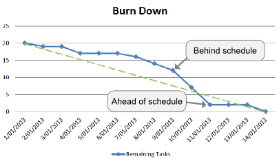
A burndown chart. The remaining number of tasks is plotted in blue, and the green dashed line is the ideal burn down line. A burndown chart. The remaining number of tasks is plotted in blue, and the green dashed line is the ideal burn down line. To read a burndown chart imagine an "ideal" line running diagonally from the top left to the bottom right corner. Some burndown chart may actually have this line indicated on the chart. The ideal line represents the required burndown to reach the goal, or the ideal position to be in at the end of each day. The actual burndown line can be compared against this line to provide a simple measure of the progress of the project. If the actual line is above the ideal line the project is behind schedule. If the actual line is below the ideal line the project is ahead of schedule. The distance above or below the line shows how much the project is ahead or behind.
The amount of work remaining in a burndown chart is typically estimated by the number of tasks remaining to be completed. This is due to simplicity and the smaller amount of volatility in the numbers compared to time estimates associated with the tasks.
Burndown charts are an important visual informational tool used by effective project managers. Burndown charts are particularly common in the agile and scrum project management methodology, where they are often used to understand and track the progress of a development sprint or release.
Why use a burndown chart?
The popularity of burndown charts stems from their simplicity. It is a simple concept to see that the number of tasks must reach zero by a defined date. The human visual system also makes it very easy to extrapolate a trend from the data and see whether the goal will be reached in time or not. Thus burndown charts are useful aids to explain and demonstrate the progress of a project to anyone, regardless of whether they match your level of experience in project management. Therefore it is often a good idea to creating a burn down chart for use in presentations and demonstrations to clients and non-technical management.
Some managers also consider burndown charts to have a motivational value. Seeing the line creep ever closer to zero will encourage and motivate project participants, and clearly demonstrate that progress is being made. Personally, I believe that other charts of project progress such as burn up charts have the same motivational power, and so motivation should not be used as a reason for choosing a burndown chart over a different progress chart.
In summary, consider making a burndown chart if simplicity is your most important communication goal, and simplicity overrides the problems with a burndown chart.
How to create a burn down chart
Burn down charts are easy to create manually using pen and paper, or they can be created by entering the data into a spreadsheet program such as excel. Alternatively software tools such as Intelligent Reports make it trivially easy to create a burndown chart for your project by using data already contained in your project management system. There is no excuse for not making a burndown chart on a regular basis to review the progress of your project.
Intelligent Reports for JIRA can automatically insert burndown charts into professional reports created from almost any aspect of your JIRA data. Intelligent Reports is the easy customizable reporting solution for JIRA, giving you complete knowledge of what is happening in your engineering team. In minutes you could have customized progress reports, timesheet reports, SLA reports and more delivered automatically to your email inbox. So if you use JIRA, what are you waiting for? Get a free 30 day trial from the Atlassian Marketplace today.
This article is part of a series on project progress charts. Articles in this series: